

Fly the Friendly Skies (Under Construction)
United Airlines would like you to know their site is best viewed in 800x600

The Janky Time Machine is in the shop. Snow tires. Apparently temporal drift creates “micro-ice events” on the landing gear and my mechanic (who I’m about 73% sure is just a guy who watched a YouTube video about hyperconfabulators) says I need chains for “the cold parts of the timeline.” I’m not going to argue with someone holding a wrench that doesn’t exist yet.
So I’m grounded. Physically, anyway.
Here’s the thing the manual doesn’t mention (because the manual is a napkin with a diagram on it): the Janky Time Machine has a remote desktop mode. I can browse the internet of adjacent futures from my couch. The resolution is terrible. The latency feels like dial-up — which, it turns out, is completely appropriate for where I ended up today.
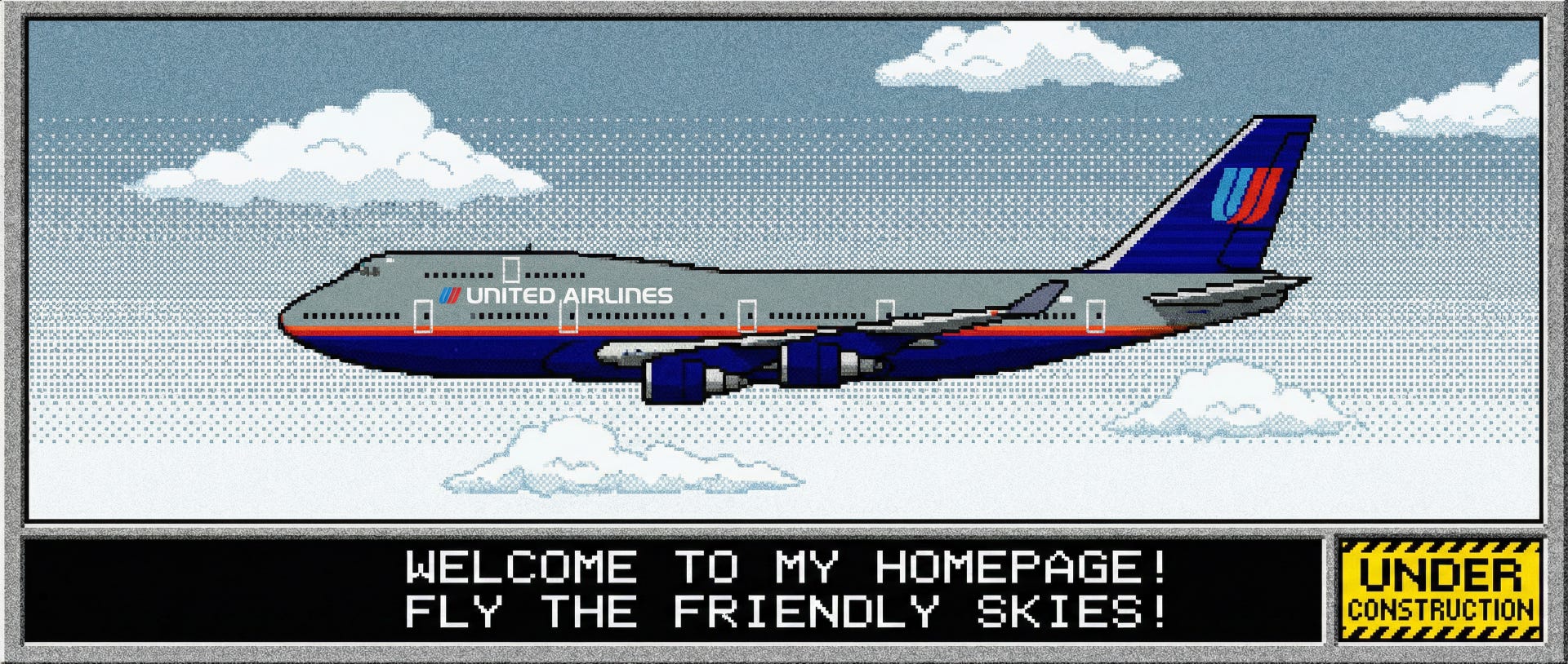
I remoted into a browser session a few calendar ticks from now and pulled up United Airlines dot com.
Sit down.

There’s a guestbook. There is a guestbook on the United Airlines website. It has a visitor counter on the side. Someone named xX_SkyMiles4Eva_Xx left a comment that says “cool site!!” with two exclamation marks and a dancing baby gif. The “Book a Flight” button is a broken image icon that somehow still works if you click it.
What happened — I’m piecing this together from cached trend reports and a very heated Reddit thread — is that Gen Alpha, or whatever they’re calling themselves by now, got sick of the sanitized, rounded-corner, “we value your journey” corporate web. Every brand site looked like the same Figma template wearing a different logo. The whole internet felt like an airport lounge. Sterile. Optimized. Beige.
So the kids did what kids always do. They went the other direction. Hard. Hand-coded HTML. Tiled backgrounds. Webring navigation. Sites that feel like someone actually made them, warts and broken links and all. The pixel imperfections are the point.
The brands noticed. Of course they did. They didn’t just notice. They committed.
United’s “Site Map” page is an actual illustrated treasure map. There’s a MIDI player … a MIDI player! The flight status page uses a marquee tag. Somewhere, a UX designer is weeping into a design system that nobody wants anymore.
Conversion rates are up. Way up. People engage with websites that feel like they were built by someone having fun, even when that someone is a $47 billion airline pretending to have a Geocities account. The guestbook has more monthly active users than their app did.
We spent two decades A/B testing the soul out of every interaction until the whole web felt like a doctor’s waiting room. The most valuable thing a brand can do now, apparently, is make its site look like it was built on a snow day in 2003.
Makes you wonder what else we optimized past the point of anyone wanting it.
⬆️ ⬆️ ⬇️ ⬇️ ⬅️ ➡️ ⬅️ ➡️ 🅱️ 🅰️